Our visual language is a summary of the principles we use to design visual assets for the University of Nebraska–Lincoln. Think of it as a shared design vocabulary that allows each creator to use similar assets, contribute new ones and communicate visually.
Design Gallery
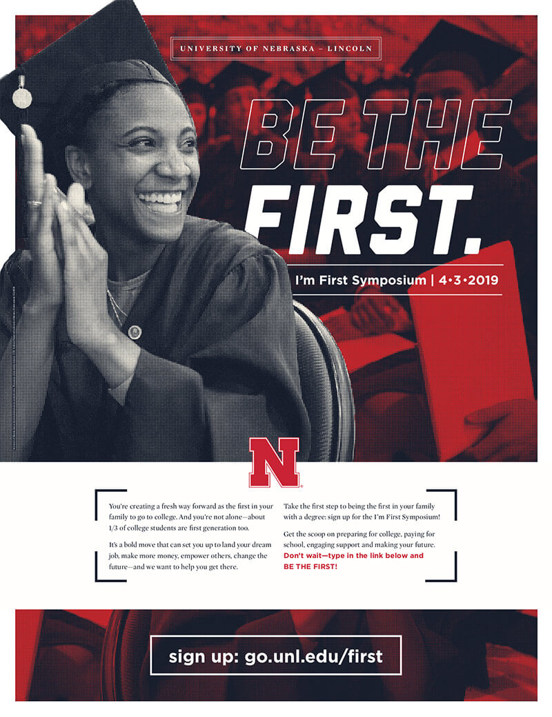
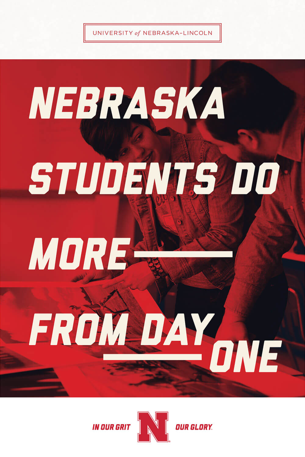
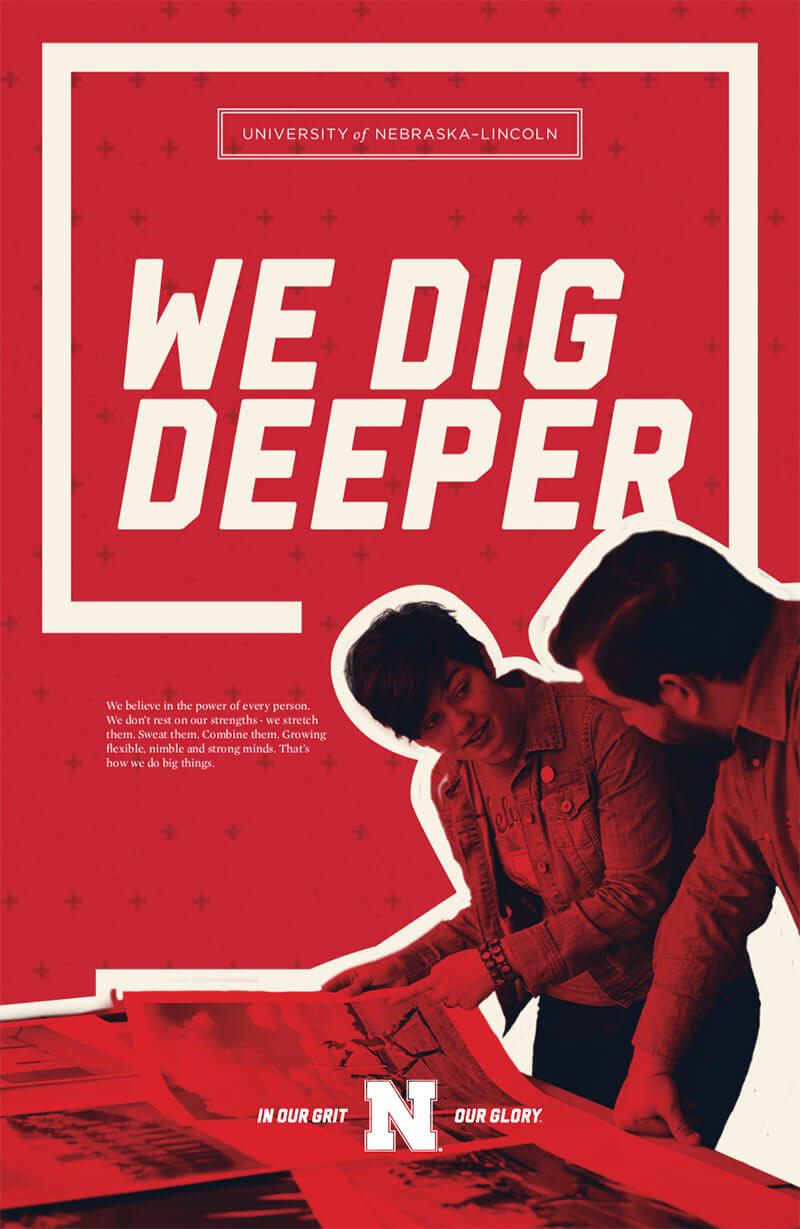
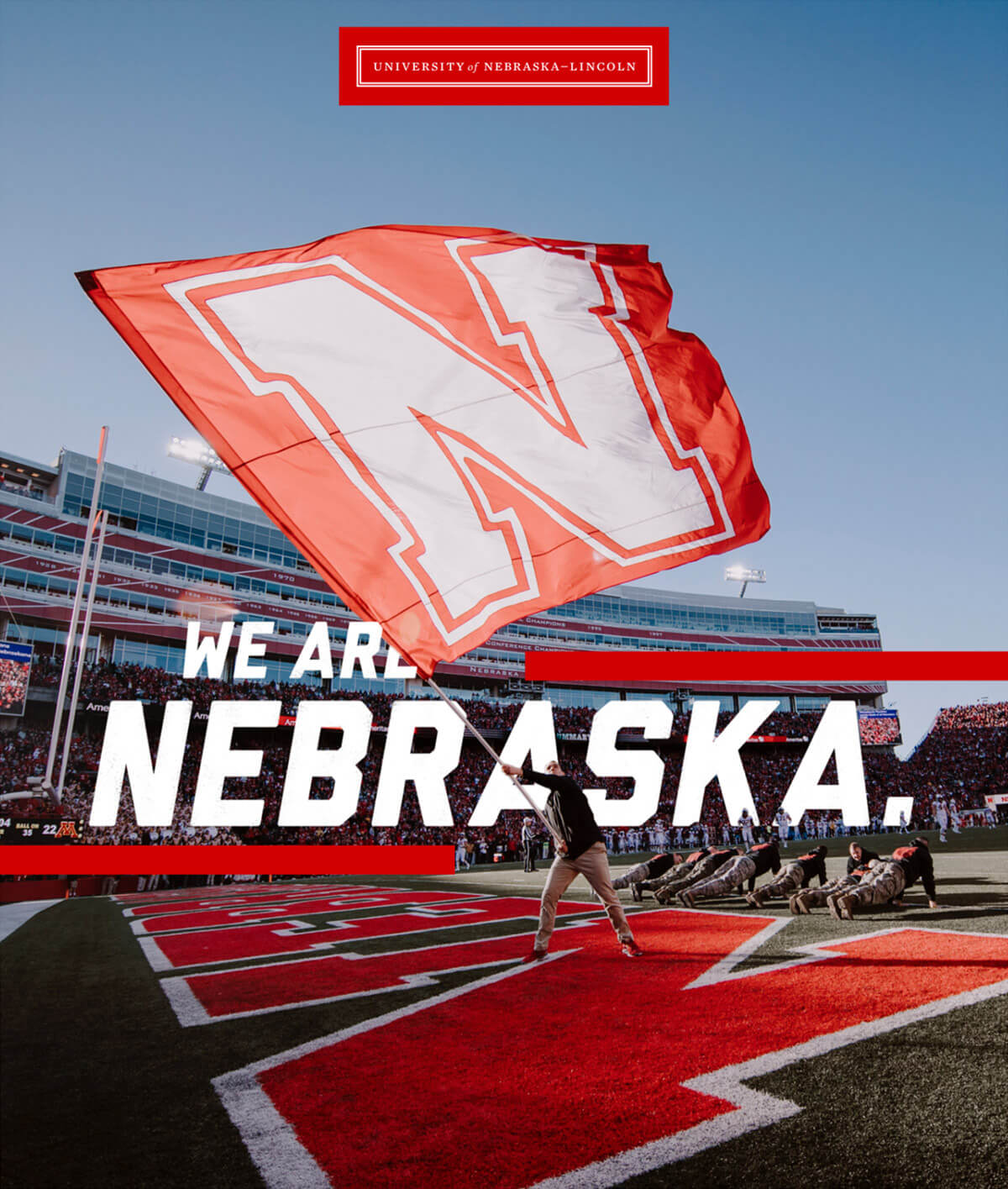
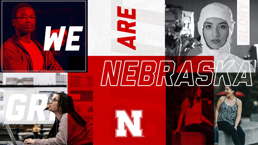
Refer to our gallery, shown below, for examples of our visual language in action


Principles
Organizations the size of the university have multiple touch points and a variety of different audiences that constantly need to be included in communication. Communication success is determined by:
- Consistent experience
- Alignment of purpose
- Buy-in from leadership
- Implementation by creators
- Assimilation/recognition of language by the audience
Foundational Elements
Foundational elements are essential for the proper identification and communication of the university. When creating visual materials for the university, these elements should be considered and included:
Supplemental Elements
Supplemental elements will enhance identification of the university as well as be recognizable as part of the university's visual language. When creating visual materials for the university, these elements should be considered and included when applicable:
Visual Cues
Each element of the visual language should be used and arranged in a manner that creates visual interest without overwhelming the audience. Here are some of the visual cues you can use to connect your design to the university brand.
NOTE: do not use these all at once.

Framed borders on photos/type

Add simple texture to type/images/background
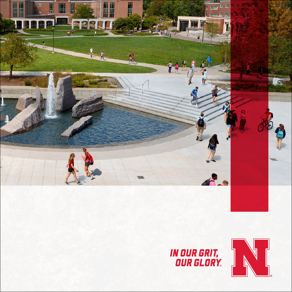
Red multiply over part of photos
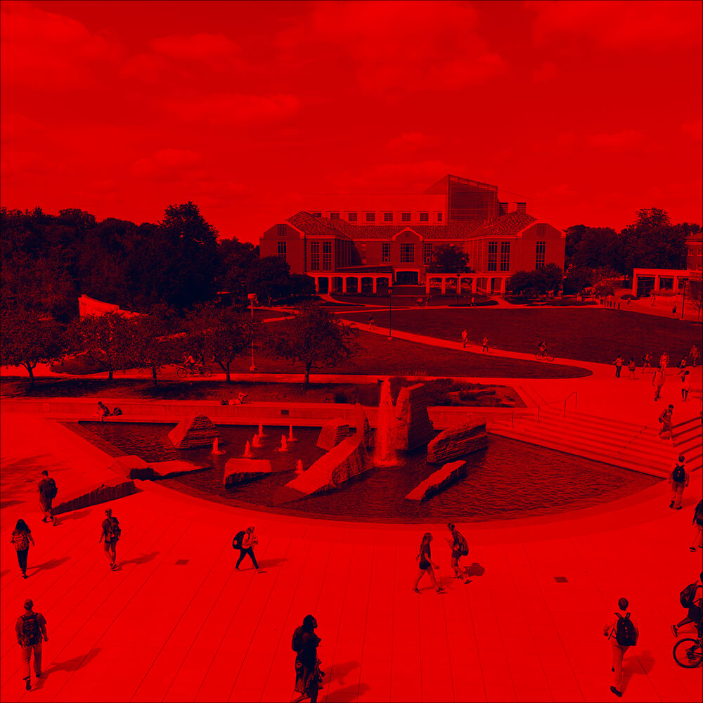
Red multiply over entire photo
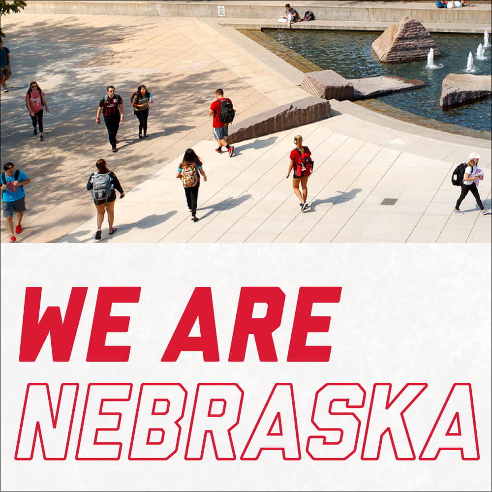
Pick one, two words as “stroke-only” text

Use Grit/Glory/Nebraska/tagline as background texture/pattern

Subject cut out of photo

Use diagonal angle of N; Overlapping type/image
Branding Dial
Each element of the visual language should be used and arranged in a manner that creates visual interest without overwhelming the audience. Here are some of the visual cues you can use to connect your design to the university brand.
Light visual cues
(More traditional)

Heavy visual cues
(More edgy)
- Tagline
- Name and Tagline
- Textures
- Red overlay
- Liberator
- Outline one word
- Red / BW photos
- Grit / Glory textured background
- Grit / Glory overlapping image

- Image cutouts, duotone overlays
- Textured text
- Diagonal strikes on photo layout
Non-Designer Tips
The Nebraska Scarlet
The university’s scarlet color is PMS 186CP at 100%. Do not use less than 100% tint or transparency, as the red immediately becomes pink. Publications must have scarlet as the dominant color.
Spot or CMYK / Process
The term spot color is referencing a print piece that is designed using a specific color usually delineated by an ink company, such as Pantone. CMYK or process color is used when you have four or more colors in a piece. Process color is always made up of four colors, hence the name 4-c process: 1) cyan (C), 2) magenta (M), 3) yellow (Y), 4) black (K). Make sure when designing your piece that you use the correct logo for a spot or process printed piece.
Color Spaces (Lab, RGB and CMYK)
A color space is a range of colors in the visible spectrum. Lab, RGB/HEX and CMYK are all color spaces.
- Lab: Lab is what people can see.
- RGB: RGB stands for Red, Green and Blue. Use this color space for anything digital - social media, video, Powerpoint, images on the web, and digital signage. but DON’T send an RGB file to print!
- CMYK: CMYK stands for Cyan, Magenta, Yellow, and Black. Use this color space for printing.
- Spot colors: Just want to print in one color like black or scarlet? You can use Pantone swatches which instructs the printer to use a pre-mixed ink.
Monitor Calibration
The main purpose of calibrating is to set white and black points, contrast, brightness and gamma (mid-tone density). Because monitors differ from one to the next (even same brand and models), no two will respond in exactly the same way. The older your monitor is, the more likely it will lessen in both brightness and clarity. For color-critical work, most monitors are dependable up to only two years. Some are better. Some are worse. You will have to be the judge. Calibrating your monitor is very important for color-critical work. Do this every time you need colors to be accurate. Even high-end soft proof workstations require frequent recalibration. You will need software to calibrate your monitor. Adobe Gamma (supplied with the Windows version of Photoshop) and Monitor Calibrator (Mac OS only) are simple to use. Both programs have “wizards” that can guide you, step by step, through the process. There are also a variety of more sophisticated software that can be purchased from third party developers, as well as high-end software that is included with the purchase of a monitor that is specifically designed for color-critical applications.
Color Use
- Images/logos in CMYK, spot or grayscale (i.e. not RGB) are appropriate to print design.
- Large areas of black need to be “rich black” (C40/M20/Y40/K100) for 4-c process jobs.
- 2-3-c = spot/PMS Colors (Identical naming conventions for spot colors; i.e., PMS 186CP = PMS 186CP, not PMS 186 CV or CVC).
- 4-c files = Process (4-color, CMYK).
- Eliminate all unused colors in the file in the swatch palette.
- Convert/remap any RGB or unneeded colors.
- Black body text = 100% black with no other ink mixes (double check for the “color” registration or auto in swatch palette, replace with 100% black)
- Go to window/output/separations preview to double check for proper color separations as appropriate to design.
Video / Photography Best Practices
Audio
For interviews, use an external microphone, either lavaliere or handheld. Using a microphone built into the camera will result in noisy, echoey audio.
Lighting
As a general rule avoid shooting into windows. The brightness outdoors will overwhelm interior subjects. Ensure subjects are adequately lit. Use plenty of natural light. Overhead lights can cause harsh shadows. If you need additional lighting and video lights are not available, bouncing a desk lamp or work light off a white wall or white card can provide soft, even lighting.